
Lightrun Answers was designed to reduce the constant googling that comes with debugging 3rd party libraries. It collects links to all the places you might be looking at while hunting down a tough bug.
And, if you’re still stuck at the end, we’re happy to hop on a call to see how we can help out.
[Feature]: Better display of scalar dispersion when grouping in the web UI
See original GitHub issueDescription
Spectacular product!
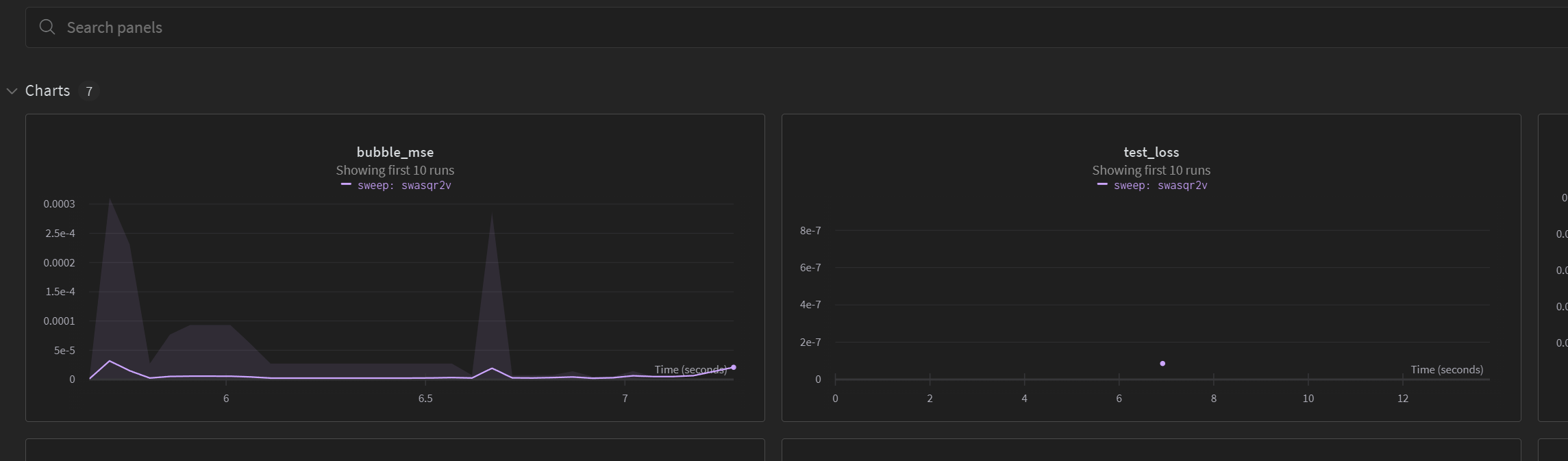
If you choose to group a sweep/etc. to see an ensemble of results, the display of anything with a sequential history is great. It shows bands and a summary statistics like the median or mean to give a sense of the dispersion.
However, if you are logging a scalar summary value, then it shows the summary statistic but there is no visual way to see the dispersion. See the following where test_loss is something logged at the end of the run for the ensemble within the sweep but which also has plenty of dispersion if you hover over the datapoint.
Suggested Solution
In a sense, what is plotted is correct because the x-axis is along time/step/etc. so there is no easy way to show it shaded. But some easy way to visualize that dispersion is still helpful.
My suggestion is to keep things simnple. If the plot is showing a single point with an ensemble then you can have a heuristic width to show it shaded around the point. The exact width doesn’t matter but it could be the entire panel because the x-axis isn’t really meaningful in that case.
Alternatives
On the other hand, the x-axis isn’t very meaningful regardless of whatever you choose so maybe the real solution is to selectively change the x-axis when things are only a scalar and do something different. Almost anything that shows a shaded region to visualize the dispersion like it does for the sequential history would be fine.
Additional Context
No response
Issue Analytics
- State:

- Created a year ago
- Comments:8
 Top Related StackOverflow Question
 Troubleshoot Live Code
 Top Related Reddit Thread
 Top Related Hackernoon Post
 Top Related Tweet
 Top Related Dev.to Post
 Top Related Hashnode Post
Thanks so much @jlperla for the detailed information, the use case is clear and I agree it would be great to render scalar dispersion of grouped runs using a different type of chart by default. I have created a feature request based on all this information, and I will keep you posted on any updates.
Sorry for the delay. I think that the picture you have in the above screenshot would look good to me as a default when you select a sweep (or a set of runs in general which do not have any “time” or “iteration” dimension. and the user wanted to see the samples. I am pretty open-minded. But it breaks down if you want to show any other “range” choices above because there is no variation on the x-axis. Let me explain this a little more holistically below.
At the core of these issues is that the x-axis is entirely artificial when you only have a scalar logged, so in some ways I think this is a symptom of a broader design question of what is the default behavior to show scalar values not associated.
To show what I mean, look at the following snippet which is when I just display a single run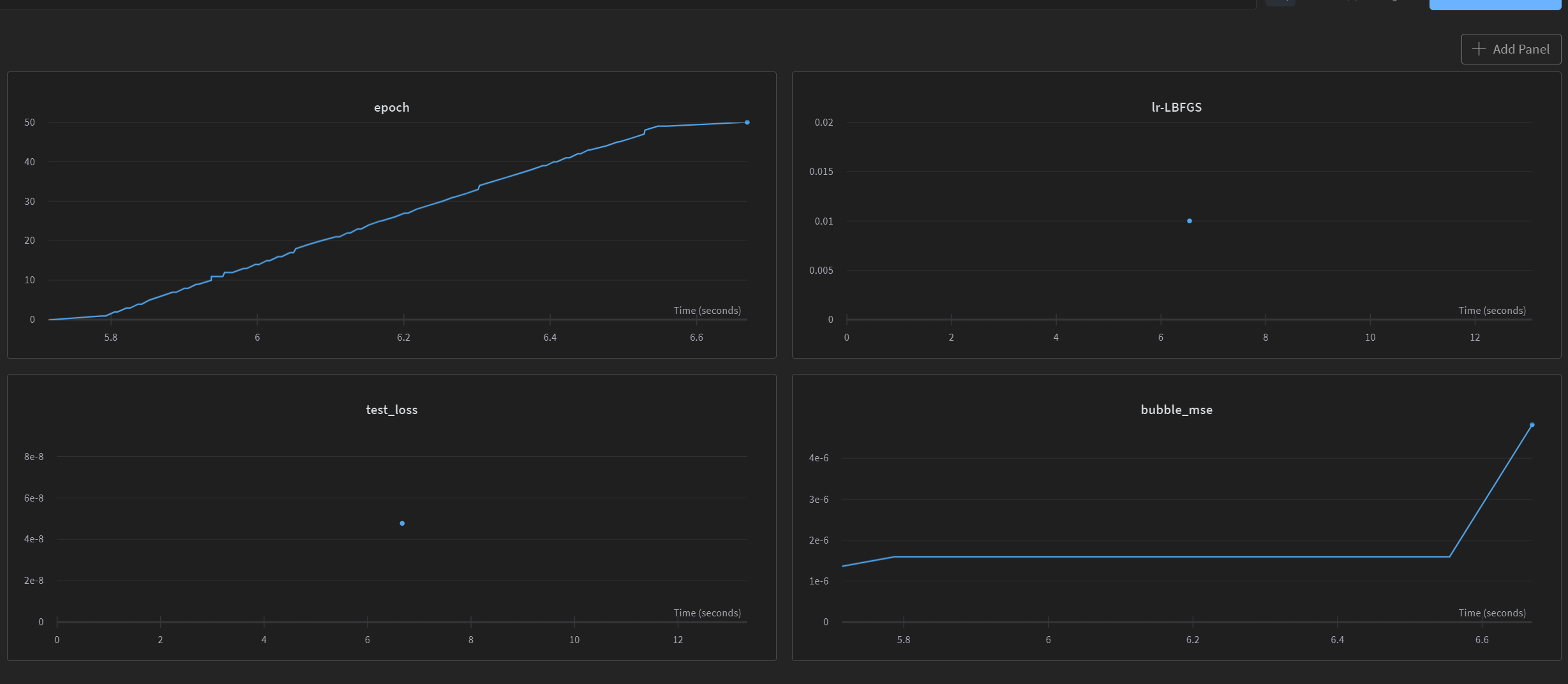
The x-axis is meaningful for the epoch and bubble_mse, but meaningless for the
lr-LBFGSandtest_lossbecause they are a single summary value and not connected to either the Wall Time, Step, epoch, or any other x-axis you would be interested in.So I would say that the default visualization in cases where the x-axis is meaningless should always change to something else. a bar? Not sure what, but you guys have done an amazing job on pretty much everything else to visualize results!
OK, now back to the specific issue of what to show when multiple runs are selected and it is a scalar value of this sort. I think that the best visualilzation would be one where you address the question of how to show it for a single run first, and then look at the quetsion of showing multiple runs as a generalization. Your display above of the points looks find for me when it shows all the samples, but it breaks down if you want to show ranges as regions - as you do when multiple runs are selected and there is a meaningful x-axis. You can’t show it as a region because there is no variation on the x-axis and you would have nothing to color it. But that is because the x-axis was artificial in the first place.
If this isn’t clear, love to discuss it quickly on zoom/etc. sometime, just send me an email (jesse.perla@ubc.ca)