
Stuck on an issue?
Lightrun Answers was designed to reduce the constant googling that comes with debugging 3rd party libraries. It collects links to all the places you might be looking at while hunting down a tough bug.
And, if you’re still stuck at the end, we’re happy to hop on a call to see how we can help out.
[Feature]: Scatter plot with parity line
See original GitHub issueDescription
Is there a way to add a parity line (x = y) to a scatter plot? For regression models, this is a great way to visualize prediction quality.
Current wandb.plot.scatter() output
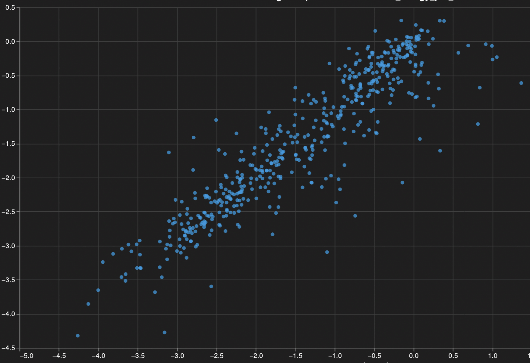
Desired

Suggested Solution
Either add a kwarg to wandb.plot.scatter(parity_line=True) or implement a more flexible API that allows adding arbitrary lines across a plot like matplotlib’s ax.axline which draws a line though any point (x, y) with given slope.
Alternatives
No response
Additional Context
No response
Issue Analytics
- State:

- Created a year ago
- Reactions:1
- Comments:11 (5 by maintainers)
 Top Results From Across the Web
Scatter plot of single cell data — FeatureScatter • Seurat
Creates a scatter plot of two features (typically feature expression), across a set of single cells. Cells are colored by their identity class....
Read more >Scatter plot with the line of equality (identity line) and the...
The purpose of the current study was to determine the association between HR increase and decrease with frailty during a localized upper-extremity function...
Read more >Scatter plots in Python
Scatter plots and Categorical Axes Scatter plots can be made using any type of cartesian axis, including linear, logarithmic, categorical or date axes....
Read more >Overlay a line function on a scatter plot - seaborn
My challenge is to overlay a custom line function graph over a scatter plot I already have, the code looks like follows:
Read more >seaborn.pairplot — seaborn 0.12.1 documentation - PyData |
Plot pairwise relationships in a dataset. By default, this function will create a grid of Axes such that each numeric variable in data...
Read more > Top Related Medium Post
No results found
 Top Related StackOverflow Question
No results found
 Troubleshoot Live Code
Lightrun enables developers to add logs, metrics and snapshots to live code - no restarts or redeploys required.
Start Free Top Related Reddit Thread
No results found
 Top Related Hackernoon Post
No results found
 Top Related Tweet
No results found
 Top Related Dev.to Post
No results found
 Top Related Hashnode Post
No results found
Hi @janosh sorry for the late reply here, the screenshot I shared above can be found when you add a
Scatter plotin the UI. However, when you log it using wandb.plot.scatter as you do, this will create a Custom chart with can be modified using the Vega specs.Therefore, in order to be consistent with your workflow, it would be best that you adapt the Vega spec in order to bring the
parityand/orregressionline. The regression line can be done if you click Edit next to Scatter plot (from the menu in your screenshot above) and paste the following Vega spec:Then you will need to do
Detach>Save as preset>scatter-regression.Once this Vega spec has been created, you can then use it when you’re logging new data such as:
If you wanted to have just the parity line
y=xyou could replace the prefinal field from above spec with the following one:I hope this helps! Please let me know if you tried this and if it worked for you or you run into any issue. I have also created an internal ticket for the engineering team according to your initial request as it would be indeed more convenient to have only one argument to generate this line.
WandB Internal User commented: thanos-wandb commented: Perfect! Thanks @janosh for confirming, glad to be of help. I will close the ticket for now, but please feel free to reopen it if you have any further related questions or issues.