Link hover states are not clear
See original GitHub issueThis issue is from a May 2019 external accessibility audit report.
WCAG Reference: Usability feedback only, there is no WCAG related guidelines. Issue ID: DAC_Issue33 URL: Throughout
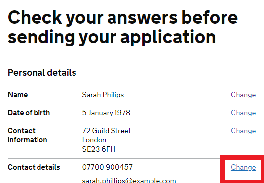
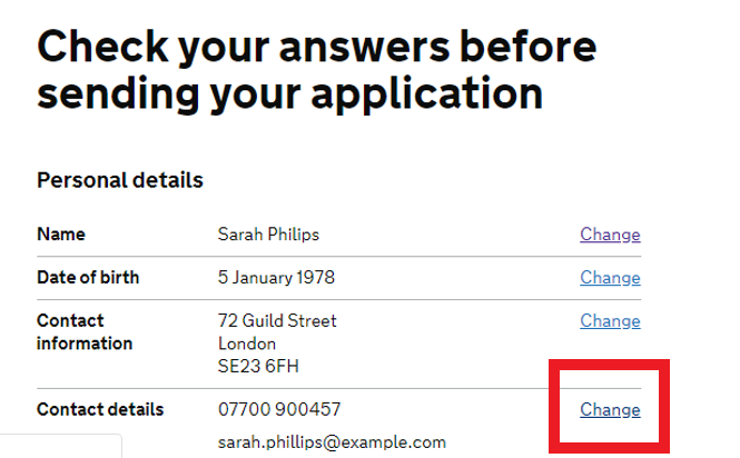
Screen Shot
Before hover

On hover

The colour change when a user hovers over a link is not clear and this was especially difficult for low vision users to determine.
Ensuring that the state change is distinctive would benefit low vision users in particular, while benefiting all mouse users in general.
Current Code Ref(s)
$govuk-link-colour #005ea5 $govuk-link-hover-colour #2b8cc4
Low vision user comments
“I had difficulty navigating the links on all pages because little visual feedback was presented when using mouse hover. While they did change to purple, this change was difficult to notice due to the links then looking similar to the regular text on mouse hover.”
Solution
Offer a clearer colour change i.e. similar to that of the keyboard focus, or add/remove an underline when users hover over the links/buttons.
Issue Analytics
- State:
- Created 4 years ago
- Comments:15 (12 by maintainers)

 Top Related StackOverflow Question
Hover state for white text behind coloured background
Background:
Over on GOV.UK we needed to address the hover state for white text behind a coloured background.
The situation arose on the COVID-19 page, where the
action linkon the page’s header doesn’t have a hover state.Rather than find a solution for this one scenario, is there a solution that works throughout GOV.UK?
Coronavirus Header
Discovery:
When hovering over a white text behind a coloured background the colour of the text will change from govuk-colour(“white”) =
#FFFFFFto#DDDCDB.This colour was discovered when experimenting the limits of adding shade/darkening the white text, all the while complying with a11y standards of 4.5:1 colour contrast ratio, the AA grade for font-sizes that is less than
19px.Experimentation/Discovery was made in this Figma file
Initial implementation
Update will be made to the
action linkGEM as per solution to prompt conversation with the front-end community within GOV.UK.Next steps
See what feedback is within the community, based on that we can roll it out throughout GOV.UK
I just looked at this in the preview and the underline seems to almost touch the following line (Win 10 & Google Chrome). The focus state doesn’t have this issue. Maybe adding a white background will sort the issue in a similar way.