
Lightrun Answers was designed to reduce the constant googling that comes with debugging 3rd party libraries. It collects links to all the places you might be looking at while hunting down a tough bug.
And, if you’re still stuck at the end, we’re happy to hop on a call to see how we can help out.
Categorical heatmap hack - how to add row-titles?
See original GitHub issueAim
I am looking to make a categorical heatmap, made up of individual strips with different categorical columns in a dataframe, somewhat similar to this figure:
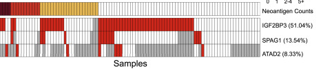 taken from this paper.
What I need help with
I cannot figure out how to add row labels to the heatmap.
Making the heatmap
I use mark_rect and only give it an x and a color. Then I remove the legend, vconcat and remove the spacing between the individual plots. The legend would provide the row label I am looking for but I have to remove it, otherwise I cannot put the individual heatmap strips together tightly.
Making the legends
For the legends, I do the same as for the heatmap, except I don’t give an x in encode(), just a color.
Configuring
Finally, I configure_concat to make the heatmap strips snugg and configure_view to remove the outline of the empty plots that each of the legends comes with.
import pandas as pd
import altair as alt
#### Generating some Data ####
source = pd.DataFrame(
    {'fruits':['apple', 'banana', 'orange'],
     'shape':['round', 'long', 'round'],
     'weight':[0.3, 0.1, 0.25]})
#### Making the Heatmap ####
heatmap = alt.vconcat(
    alt.Chart(source).mark_rect().encode(
        x = alt.X('fruits', axis=None),
        color = alt.Color('shape', legend=None),
    ),
    alt.Chart(source).mark_rect().encode(
        x = 'fruits',
        color = alt.Color('weight', legend=None),
    )
)
#### Making the Legends ####
legends = alt.vconcat(
    alt.Chart(source).mark_rect(
        fillOpacity=0,
        strokeOpacity=0
    ).encode(
        color = alt.Color('shape'),
    ),
     alt.Chart(source).mark_rect(
        fillOpacity=0,
        strokeOpacity=0
    ).encode(
        color = alt.Color('weight'),
    ),
)

#### Configuring the concat ####
(
    heatmap | legends
).configure_concat(spacing=0 #makes strips of heatmap snugg
).configure_view(strokeOpacity=0) #removes plot border for the empty plots with the legends
This gives me the following heatmap:
Adding Row labels
The row labels here should be 'shape' and 'weight' but I cannot get that to work.
My idea was to use the title as a row label with orient='left' and angle=90 but that doesn’t seem to work.
alt.Chart(source, title="shape").mark_rect().encode(
        x = alt.X('fruits', axis=None),
        color = alt.Color('shape', legend=None),
).configure_title(
    orient='left',
    angle=90
)

I don’t think I understand what the angle argument does in configure_title, because it doesn’t seem to rotate the title text, whether I give orient or not. From the docstring of configure_title:
angle : float Angle in degrees of title and subtitle text.
Thanks
Thank you for all the awesomeness in altair, the library is a true delight!
Issue Analytics
- State:

- Created 3 years ago
- Comments:7 (3 by maintainers)
 Top Related StackOverflow Question
 Troubleshoot Live Code
 Top Related Reddit Thread
 Top Related Hackernoon Post
 Top Related Tweet
 Top Related Dev.to Post
 Top Related Hashnode Post
Unless you reference the calculation in an encoding, it will not be used in the chart:
One way to do this kind of thing is to use a fold transform, and then use either a row encoding or a y-encoding; something like this:
This only works if you’re OK with all values being represented by the same color scale.