
Lightrun Answers was designed to reduce the constant googling that comes with debugging 3rd party libraries. It collects links to all the places you might be looking at while hunting down a tough bug.
And, if you’re still stuck at the end, we’re happy to hop on a call to see how we can help out.
I have a rect based heatmap create on top of the following figure:
fig = figure(title="Detailed view",
                 x_axis_type="datetime",
                 y_range=FactorRange(),
                 y_axis_location='right',
                 tools="xpan,reset,undo",
                 min_border=0,
                 active_drag='xpan',
                 plot_height=height,
                 output_backend="webgl",
                 **theme['plot'])
the tect is defined as follows:
rect = fig.rect(x=x,
                    y='Tags',
                    width=glyph_size,
                    height=1,
                    source=source,
                    line_color={
                        'field': 'value',
                        'transform': mapper
                    },
                    fill_color={
                        'field': 'value',
                        'transform': mapper
                    },
                    selection_color={
                        'field': 'value',
                        'transform': selected_mapper
                    },
                    hover_line_color=theme['heatmap_colors']['hover'],
                    nonselection_fill_alpha=1,
                    nonselection_line_alpha=1)
Where glyph_size is a float representing the size in milliseconds.
The chart has a green background and paints white rect glyphs where the data frame is not NaN.
For some reason I see the following:
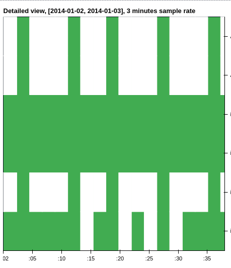
Notice the random green columns in the chart.
These are not real, there is data there!
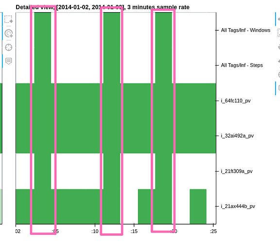
Here we can see that we have a data point at 00:00 that should be 3 minutes size (180000ms glyph size).
For some reason, 2 errors occur in this chart:
- the glyphs are not center around the correct time (or the x_range is not aligned, who knows)
- the size of the glyphs seems to be incorrect.
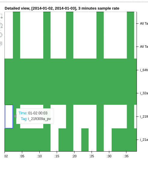
We can see here, that the point should be at 00:03 but it’s positioned somewhere around 00:01!
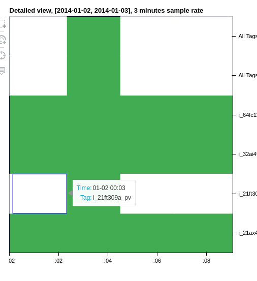
What I was originally trying to achieve: draw a time-series based heatmap with the glyphs starting from their respective timestamps and in the size of the sample rate (in this case 3 minutes)
Thank you!
Issue Analytics
- State:

- Created 3 years ago
- Comments:5 (3 by maintainers)
 Top Related StackOverflow Question
 Troubleshoot Live Code
 Top Related Reddit Thread
 Top Related Hackernoon Post
 Top Related Tweet
 Top Related Dev.to Post
 Top Related Hashnode Post
BTW, for future reference, i shifted to use
quadwith a distinctive left right values, which made it correct, and even faster on larger data sets.Thanks you all for the responses
Thank you @bryevdv. It does seems like a duplicate of #10488