
Lightrun Answers was designed to reduce the constant googling that comes with debugging 3rd party libraries. It collects links to all the places you might be looking at while hunting down a tough bug.
And, if you’re still stuck at the end, we’re happy to hop on a call to see how we can help out.
[BUG] Whiskers do not appear in categorical plots?
See original GitHub issueSoftware version info
OS: Linux 5.6.0-2-amd64 #1 SMP Debian 5.6.14-2 (2020-06-09) x86_64 GNU/Linux Bokeh version: 2.2.2 Python version: 3.8.6
Description of expected behavior and the observed behavior
I used to be able to combine whiskers into categorical plots using Bokeh 1.4.0. When I upgraded to 2.2.2, the whiskers disappeared. The plot I have in mind is a dotplot + whiskers + multi-category plot, with the (single) dot indicating the mean and whiskers as stderr.
Complete, minimal, self-contained example code that reproduces the issue
(this code is lightly edited from https://docs.bokeh.org/en/latest/docs/user_guide/annotations.html?highlight=whisker, and incorporates some categorical code (e.g. x_range=FactorRange(*x)) from https://docs.bokeh.org/en/latest/docs/user_guide/categorical.html.
from bokeh.models import ColumnDataSource, Whisker, FactorRange
from bokeh.plotting import output_file, figure, show, save
from bokeh.sampledata.autompg import autompg as df

output_file('whiskers.html')

colors = ["red", "olive", "darkred", "goldenrod", "skyblue", "orange", "salmon"]

base, lower, upper, mpg = [], [], [], []

for i, year in enumerate(list(df.yr.unique())):
    year_mpgs = df[df['yr'] == year]['mpg']
    mpgs_mean = year_mpgs.mean()
    mpgs_std = year_mpgs.std()
    lower.append(mpgs_mean - mpgs_std)
    upper.append(mpgs_mean + mpgs_std)
    mpg.append(mpgs_mean)
    #base.append(str(year))
    base.append((str(year), 'a'))

#p = figure(plot_width=600, plot_height=300, title="Years vs mpg with Quartile Ranges")
p = figure(x_range=FactorRange(*base), plot_width=600, plot_height=300, title="Years vs mpg with Quartile Ranges")
source_error = ColumnDataSource(data=dict(base=base, lower=lower, upper=upper, mpg=mpg))
p.scatter(x='base', y='mpg', source=source_error)

p.add_layout(
    Whisker(source=source_error, base="base", upper="upper", lower="lower")
)

save(p)
Stack traceback and/or browser JavaScript console output
Screenshots or screencasts of the bug in action
When the code is run as provided above, this is what I got.
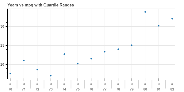
When the commented statements are uncommented (i.e. #base.append(str(year)) and #p = figure(plot_width=600, plot_height=300, title="Years vs mpg with Quartile Ranges")), and the line following that is commented out, I get

Not exactly sure what’s wrong, but it seems to me that Whisker seem to only appear on numerical-type axis, not a factorial-type one? Thanks for looking into this!
Issue Analytics
- State:

- Created 3 years ago
- Reactions:2
- Comments:5 (2 by maintainers)
 Top Related StackOverflow Question
 Troubleshoot Live Code
 Top Related Reddit Thread
 Top Related Hackernoon Post
 Top Related Tweet
 Top Related Dev.to Post
 Top Related Hashnode Post
@alucab the fix for this is merged and will be in the upcoming 2.3.0 release
Currently most annotations are limited to numerical axes, though it should be pretty simple to lift this restriction in
Whisker’s case.