
Stuck on an issue?
Lightrun Answers was designed to reduce the constant googling that comes with debugging 3rd party libraries. It collects links to all the places you might be looking at while hunting down a tough bug.
And, if you’re still stuck at the end, we’re happy to hop on a call to see how we can help out.
Plot categories changed in 0.4.0
See original GitHub issueMy apologies if this was raised before, I haven’t had the time to do a proper issue search.
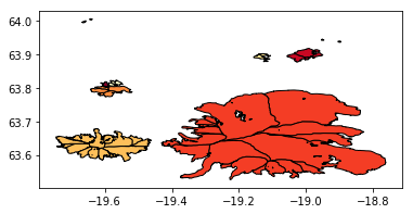
The following code used to create a multicolor plot in geopandas 0.3.0 but not 0.4.0 (or master).
Here the file: clusters.tar.gz
import geopandas as gpd
import matplotlib.pyplot as plt
import matplotlib

print(gpd.__version__)
print(matplotlib.__version__)
df = gpd.read_file('tar://clusters.tar.gz')
df.plot(column='cluster_id', edgecolor='k', cmap='YlOrRd');
Outputs:
0.4.0
3.0.2

/home/mowglie/.pyvirtualenvs/py3/lib/python3.5/site-packages/numpy/core/_methods.py:32: RuntimeWarning: invalid value encountered in reduce
  return umr_minimum(a, axis, None, out, keepdims, initial)
/home/mowglie/.pyvirtualenvs/py3/lib/python3.5/site-packages/numpy/core/_methods.py:28: RuntimeWarning: invalid value encountered in reduce
  return umr_maximum(a, axis, None, out, keepdims, initial)
/home/mowglie/.pyvirtualenvs/py3/lib/python3.5/site-packages/matplotlib/colors.py:512: RuntimeWarning: invalid value encountered in less
  xa[xa < 0] = -1
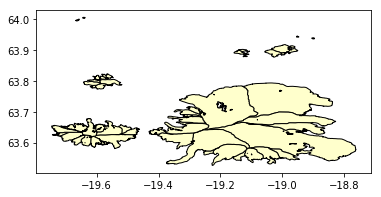
And in 0.3:
0.3.0
3.0.2

/home/mowglie/.pyvirtualenvs/py3/lib/python3.5/site-packages/matplotlib/colors.py:512: RuntimeWarning: invalid value encountered in less
  xa[xa < 0] = -1
Issue Analytics
- State:

- Created 5 years ago
- Comments:6 (6 by maintainers)
 Top Results From Across the Web
plot_diff(): analyze differences — DataPrep 0.4.0 documentation
We start by calling plot_diff([df1, df2]) which computes dataset-level statistics, a histogram for each numerical column, and a bar chart for each categorical ......
Read more >matplotlib - 2D and 3D plotting in Python
This line configures matplotlib to show figures embedded in the notebook, # instead of opening a new window for each figure. More about...
Read more >decision plot — SHAP latest documentation
SHAP decision plots show how complex models arrive at their predictions (i.e., ... The feature order has changed on the y-axis based on...
Read more >Plotly.py 4.0 is here: Offline Only, Express First, Displayable ...
Read on for a detailed explanation of what has changed and why, or check out the ... Parallel Coordinates and Parallel Categories plots....
Read more >Handling categorical data — Bokeh 2.4.0 Documentation
Bar charts are useful when there is one value to plot for each category. ... the FactorRange , for example, by changing the...
Read more > Top Related Medium Post
No results found
 Top Related StackOverflow Question
No results found
 Troubleshoot Live Code
Lightrun enables developers to add logs, metrics and snapshots to live code - no restarts or redeploys required.
Start Free Top Related Reddit Thread
No results found
 Top Related Hackernoon Post
No results found
 Top Related Tweet
No results found
 Top Related Dev.to Post
No results found
 Top Related Hashnode Post
No results found
Got it.
mn = values.min() if vmin is None else vminandmx = values.max() if vmax is None else vmaxare both returningnan. That’s why it does not plot colours - it is passing range from nan to nan. Previous version was passing Series, which ignores NaNs in min() and max(). Now it is passing numpy array which returns NaN for min() and max(), I’ll make PR to fix it.sorry for not seeing that, too much on my plate right now -> removing NaNs also solves the plot.
It used to be more robust in geopandas v0.3, though. Should I leave the issue open?