
Lightrun Answers was designed to reduce the constant googling that comes with debugging 3rd party libraries. It collects links to all the places you might be looking at while hunting down a tough bug.
And, if you’re still stuck at the end, we’re happy to hop on a call to see how we can help out.
Change "Retry" button UI in inline error notice to visually appear like an inline link
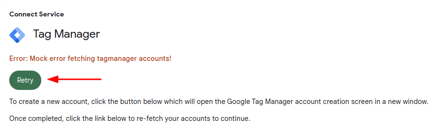
See original GitHub issueFollow-up to #5494: While that issue correctly implements the “Retry” button in inline notices (e.g. in module setup flows), having a primary CTA button in those error notices looks a bit odd (see https://github.com/google/site-kit-wp/issues/5494#issuecomment-1289347228).
They should become a regular inline link instead.
Do not alter or remove anything below. The following sections will be managed by moderators only.
Acceptance criteria
- The “Retry” button in the
ErrorNoticecomponent should be visually rendered differently, looking more like a regular link. Additionally, it should appear right after the error text, i.e. not on a new line.- This only applies to the
ErrorNoticecomponent outside of the SK dashboard, in the dashboard widgets (seeReportErrorcomponent), the “Retry” button should continue to appears as it does now.
- This only applies to the
Implementation Brief
- In
assets/js/components/ErrorNotice.js:- Simply replace the
<Button />component forRetrywith a<Link />component. - Replace the
<Fragment />with adivhavingdisplay: flexand a suitable CSSgapvalue to render the<Link />directly after the<ErrorText />.
- Simply replace the
Test Coverage
- No tests need to be added/updated.
- Update VRT references if required.
QA Brief
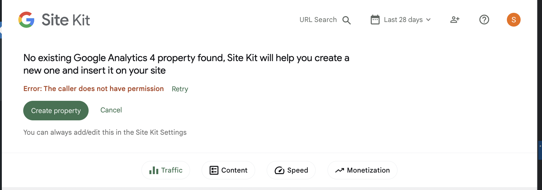
Update: This has been reverted so please do a regression test by following the QAB on #5494 and verifying that the Error Notice displays with the link as a button like so:
~* Make error notice appear (eg try setup empty property in GA4 activation banner)~ ~* Check the error notice appearing inline as per the screenshot below~
Screenshot
Changelog entry
- N/A.
Issue Analytics
- State:

- Created a year ago
- Comments:13 (1 by maintainers)
 Top Results From Across the Web
 Top Related Medium Post
 Top Related StackOverflow Question
 Troubleshoot Live Code
 Top Related Reddit Thread
 Top Related Hackernoon Post
 Top Related Tweet
 Top Related Dev.to Post
 Top Related Hashnode Post
Thanks @felixarntz, I have created a PR to revert the change: #6165
Approval ❌
@techanvil @nfmohit @sashadoes After taking a closer look, this issue’s implementation will unfortunately need to be reverted. This is not due to the implementation itself, but rather because the ACs here are not really helping with the UX problem from before, they just introduce another new UX problem.
After reviewing this with @aaemnnosttv and @marrrmarrr, while both versions of the UI are problematic, it’s better for now to stick to the old one. That said, we should definitely address this in a proper way, for which I’ve opened #6162.
The PR for this issue should be reverted and afterwards it can be closed as
invalid.