
Stuck on an issue?
Lightrun Answers was designed to reduce the constant googling that comes with debugging 3rd party libraries. It collects links to all the places you might be looking at while hunting down a tough bug.
And, if you’re still stuck at the end, we’re happy to hop on a call to see how we can help out.
Mobile UX/UI issues on Graphs when in Gathering state
See original GitHub issueBug Description
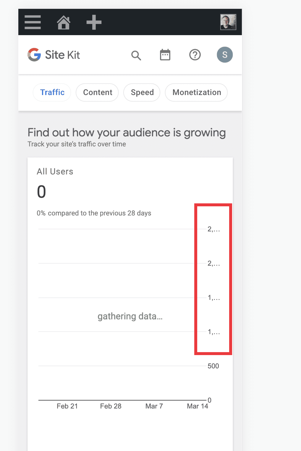
While testing #4697 I noticed a few minor UX/UI issues on mobile with the graphs on the main and entity dashboards.
Both of these issues only occur when the site is at gathering... state.
- On the All Traffic widget: the y axis values are cut off, i.e.
2...I could recreate this on all small screen sizes. What’s interesting is that the values are in the thousands for gathering data but hundreds for zero data. So, this is why I could not recreate these issues with zero data. See screenshots below.
Screenshots
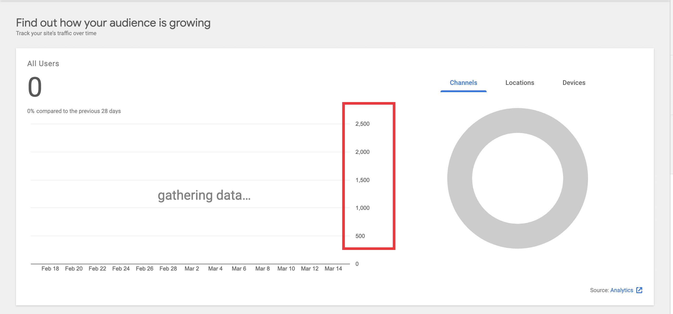
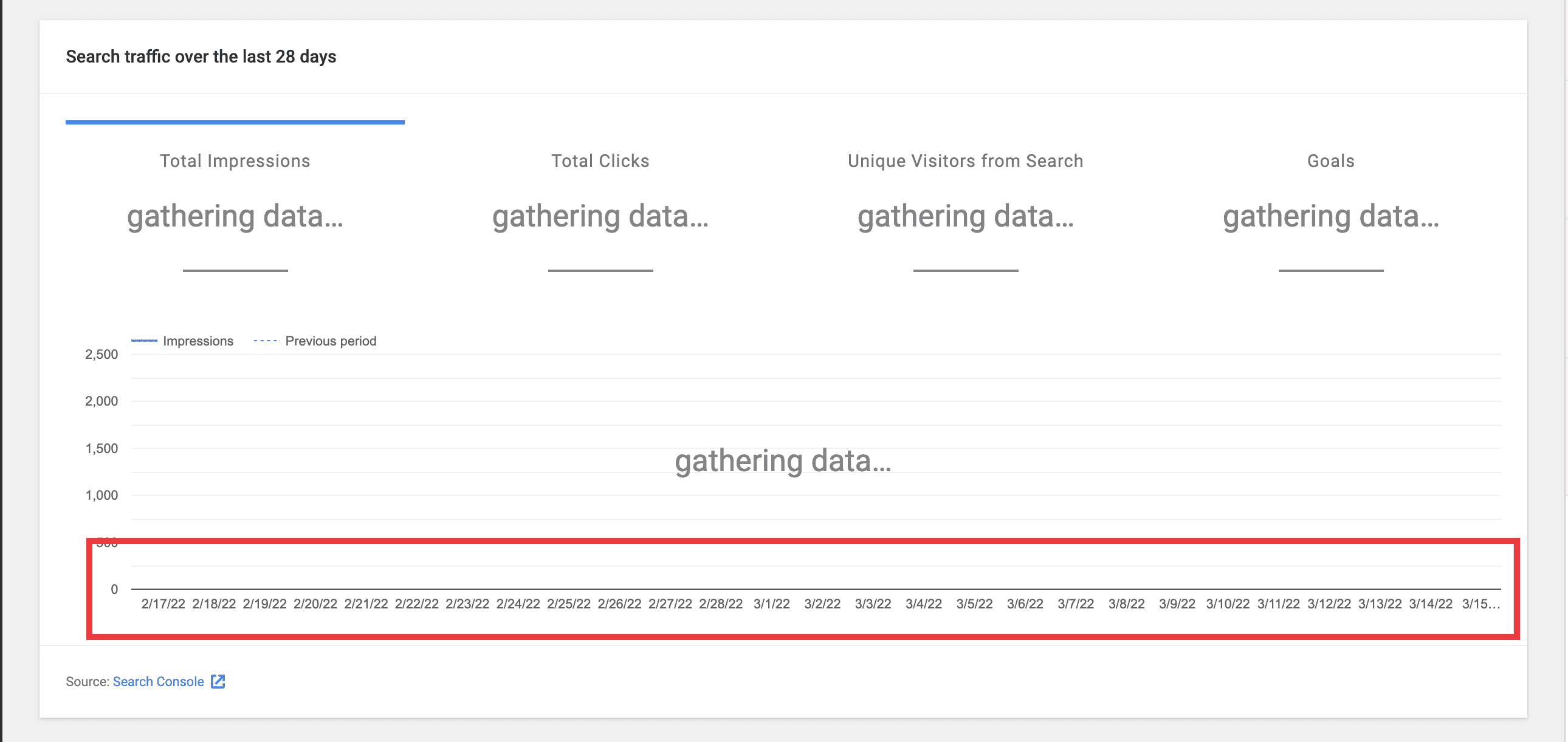
- On the Search traffic widget, the x axis values are also cut off. I could recreate this on all small screen sizes. For this issue, it’s actually a problem on desktop and mobile as you can see in the screenshots below. There are many more dates for gathering data, and this isn’t an issue on zero data that I could see from my testing.
Screenshots

Do not alter or remove anything below. The following sections will be managed by moderators only.
Acceptance criteria
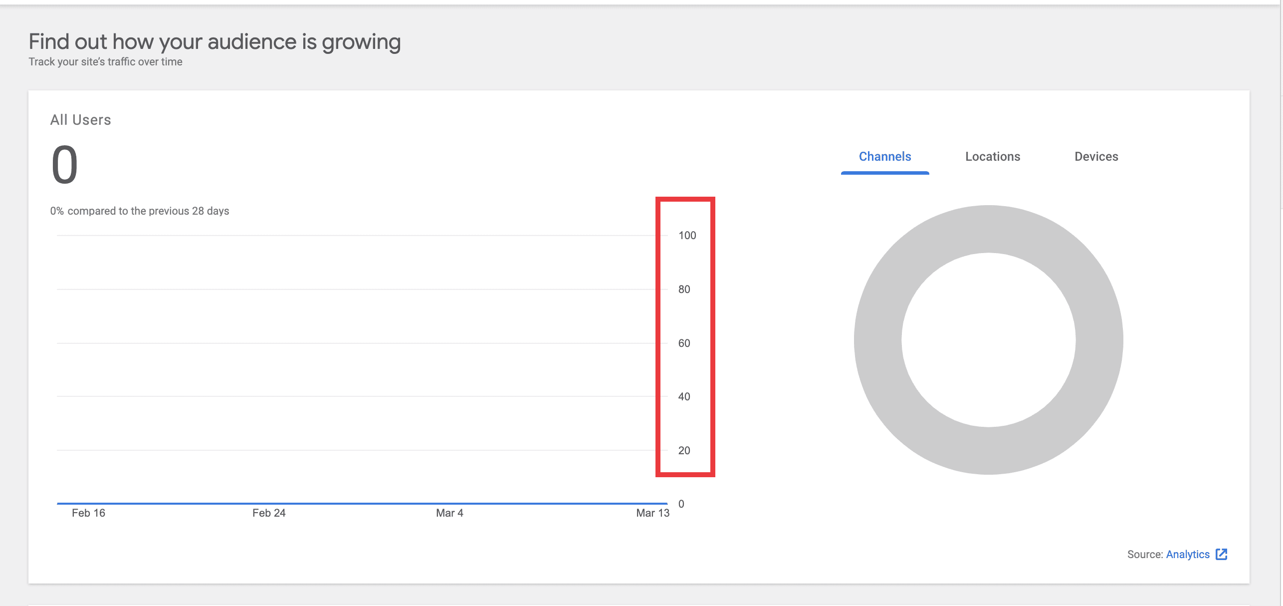
- The y-axis labels for any graph should be consistent regardless of whether the associated service is in “zero data” or “gathering data” state.
- In other words, whatever values we choose for the labels, they shouldn’t differ based on the circumstance above.
- It doesn’t really matter on whether the labels are steps of 10, 100, 1000, … Whatever works. It should just be consistent. The labels can essentially be any interval here since all values are 0 (or there are none), so the dimensions of the data is undefined.
- The y-axis labels for such graphs (e.g. zero data or gathering data state) should not be cut off in smaller viewports (or in any viewport fwiw).
- The x-axis labels for such graphs (e.g. zero data or gathering data state) should not be cut off in smaller viewports (or in any viewport fwiw).
Implementation Brief
Ensure y-axis label consistency between zero-state and gathering data views
- Correct the references to
vaxisinGoogleChart, it should be camel-cased, i.e.vAxis. https://github.com/google/site-kit-wp/blob/d1ebb0f15c2e0e74c308a032e535ad7f1e9c63ce/assets/js/components/GoogleChart.js#L204-L207 - Revert the default
vAxismaximum value from2500to100. https://github.com/google/site-kit-wp/blob/d1ebb0f15c2e0e74c308a032e535ad7f1e9c63ce/assets/js/components/GoogleChart.js#L208- Note: The original spec for the introduction of this default value specified it to be
100(see the IB for #4696). It was updated to2500with the intent of matching the Figma mock of the Search Funnel widget (see screenshot in #4696). However, this value of2500is at odds with the zero-data value which is just1. Additionally, theGoogleChartcomponent is general purpose and the value100is more in keeping with the broader usage of it, as evident when examining the zero-datavAxismaximum values for the relevant components (those which render aLineChartwith thegatheringDataprop, at the time of writing:UserCountGraph,SiteStats,AnalyticsStats,SearchConsoleStatsandStats).
- Note: The original spec for the introduction of this default value specified it to be
Prevent y-axis label truncation
- Reducing the
vAxismaximum value from2500to100(see above) mitigates the truncation problem to a large degree. Having investigated the relevant chart-rendering components listed above, it appears that only one small tweak is necessary to prevent the top-most value inUserCountGraphfrom being truncated at a very narrow viewport, as highlighted here:

- Changing
chartArea.widthfrom90%to89%will prevent this truncation. https://github.com/google/site-kit-wp/blob/52dc809d41a8f33f9c8d42218b4c3f68f538a2e0/assets/js/modules/analytics/components/dashboard/DashboardAllTrafficWidget/UserCountGraph.js#L236
Prevent x-axis label truncation
- Remove the lines that
delete chartOptions.hAxis.ticks. https://github.com/google/site-kit-wp/blob/c7cd510d192d177737e42a63508022fd6bf35a64/assets/js/components/GoogleChart.js#L212 https://github.com/google/site-kit-wp/blob/c7cd510d192d177737e42a63508022fd6bf35a64/assets/js/components/GoogleChart.js#L216 - Instead, generate a sequence of ticks from
startDatetoendDate. The ticks should beDateinstances. This should override anything inchartOptions.hAxis.ticks.
Test Coverage
- Ensure the VRT reference images are updated where necessary.
QA Brief
During testing, either use accounts which are in “gathering data” and “zero data” states, or use the Tester plugin to force these states.
- Setup Site Kit with Analytics connected and enable the
unifiedDashboardfeature flag. - Navigate to the Dashboard and verify the line charts in the All Users and Search traffic widgets render with consistent y-axis labels when in “gathering data” vs “zero data” states (use the Tester plugin to force these states). Ensure neither the x or y-axis labels are truncated.
- Disable the
unifiedDashboardfeature flag, navigate to the Search Console page and verify the same for the the Overview widget. - Navigate to the Analytics page and verify the same for the Audience overview widget.
- Using an account with data, ensure these graphs display correctly.
Changelog entry
- Fix Google chart labels to no longer be truncated due to lack of space.
Issue Analytics
- State:

- Created 2 years ago
- Comments:23 (5 by maintainers)
 Top Results From Across the Web
8 App UX Design Mistakes In Navigation You Should Avoid
1. Getting Users Lost · Crammed · Too Minimalist · Hidden Navigation Elements · Not Visible Enough · Loss of Balance.
Read more >Mobile App Design Guide: Step-by-step UI/UX Process in 2022
During the application design process, the most commonly overlooked issues are empty state (the lack of a user-friendly UI when no data is ......
Read more >Error Screens and Messages: UX Design Practices - Tubik Blog
Interface error is the state or condition when the app cannot do what the user wants. It usually happens in three typical cases:...
Read more >A Comprehensive Guide To Mobile App Design
There are many things to consider when designing for mobile. We're sure that this detailed guide will help you get rid of that...
Read more >Mobile UX Design Best Practices - From Start to Finish | Toptal
The aim of most UX designers is to provide pleasurable experiences and come up with great designs which achieve both discoverability (what actions...
Read more > Top Related Medium Post
No results found
 Top Related StackOverflow Question
No results found
 Troubleshoot Live Code
Lightrun enables developers to add logs, metrics and snapshots to live code - no restarts or redeploys required.
Start Free Top Related Reddit Thread
No results found
 Top Related Hackernoon Post
No results found
 Top Related Tweet
No results found
 Top Related Dev.to Post
No results found
 Top Related Hashnode Post
No results found
Thanks @techanvil ! Looks like
chartArea.rightis quite useful here! I think it’s fine to use as it seems odd that the chart would really allow for one and not the other (even if undocumented) – it’s probably just a mistake that it isn’t documented.As for the value, I found that there were still some places where a date label was being truncated with
right: 20(see here in Storybook with a viewport width from ~700-950), although25seemed to do the trick across the board.Let’s not worry too much about finding the exact perfect value but I think if we can find something close to this which avoids truncating the labels in all viewports we should be good to go 👍
Hi @felixarntz, thanks for the suggestion here - it’s a good point to consider, but having looked into it, I don’t think we’ll achieve better results using a combination of percentages.
However: Looking into this in more depth, I have unfortunately discovered that my suggestion of
left: 60, width: 90%still results in label truncation in some cases. ~I suspect that a workable fix is to render with differentchartArea.widthvalues depending on the breakpoint.~ I’ll go into that toward the end of this comment.Update: I have discovered what appears to be an undocumented property of
chartArea. It looks like simply specifyingchartArea.right: 20works and prevents the label truncation.chartArea.rightis not mentioned in the docs but is working in my local testing.I’ve updated my PR #5040 with this fix if anyone wants to take a look. Although it’s arguably a little risky using what appears to be an undocumented property, I think we should be OK to go ahead with this, given we have VRT coverage of the related components that would alert us if anything were to change. Interested to know what you think.
Analysis
The
hAxislabel truncation seems to be occurring when the chart renderer wants to draw a label beyond the bounds of thechartArea, but there isn’t room between the chart area and the edge of the chart itself. Bear in mind the “chart area” is defined as “where the chart itself is drawn, excluding axis and legends”.To illustrate, here’s a chart where you can see the label extends beyond the chart area. The horizontal lines of the chart indicate the chart area, and I have coloured the chart container green to show the edge of the chart (green = beyond the chart bounds).
This chart is using
left: 60, width: 90%for thechartArea.Increasing
chartArea.widthto95%, the amount of space between the chart area and edge of the chart is reduced to the point where the label can’t fit and is truncated:Increasing
chartArea.widthto100%, the chart area extends fully to the edge of the chart. It’s hard to see at first glance but the label is still truncated, to a single..Now, if we were to change to a combination of percentages where they add up to
100%, we’ll still end up in the same situation. For example, this is the chart withleft: 5%, width: 95%. The label is truncated exactly the same, to a single..Evidently, the label truncation is a product of the available width between the chart area and the edge of the chart, regardless of how this available width is determined. Furthermore, specifying a fixed value for
leftworks better than a percentage, as thevAxislabels take up a consistent amount of space regardless of the viewport or container width.To illustrate the problem with using a percentage for
left: At a narrow viewport of450px, in order for thevAxisto display fully, the minimum percentage forleftis15%.Note I’m using
1,000,000as the max value as this is the max viewable at60pxwithout truncating. I have setchartArea.widthto be80%to allow5%space on the right hand side, to avoidhAxistruncation, as above.However at the arbitrarily wide viewport of
1650px, thechartArea.leftvalue of15%is clearly too wide:Unfortunately, it seems apparent there’s no single combination of percentages that would work well across the board.
Arguably we could render different percentages for
leftdepending on the breakpoint but again, seeing as the label width is fixed and predictable, it seems we’d be better off sticking with a fixed value, e.g.60px.As mentioned at the start of this comment, having dug into things more, I have found some scenarios where the proposed
left: 60, width: 90%still results in label truncation. For example:Selecting “Last 90 days” at
320pxviewport:Selecting “Last 14 days” at
820pxviewport:Based on the analysis above it seems we should ensure that sufficient space is left between the chart area and the right-hand side of the chart. ~In order to do so, we could render the chart using different
chartArea.widthvalues depending on the breakpoint.~Taking some quick measurements I can see that about
~14-15pxof space is needed to prevent truncation. Allowing a margin for error, we could aim for a minimum of~20pxspace at all breakpoints.Update I have found what appears to be an undocumented property of
chartArea, and as mentioned at the top, specifyingchartArea.right: 20is giving me good results in my local testing.cc @aaemnnosttv