
Lightrun Answers was designed to reduce the constant googling that comes with debugging 3rd party libraries. It collects links to all the places you might be looking at while hunting down a tough bug.
And, if you’re still stuck at the end, we’re happy to hop on a call to see how we can help out.
a11y: Low contrast icon and links in high contrast message bar
See original GitHub issueDescribe the bug
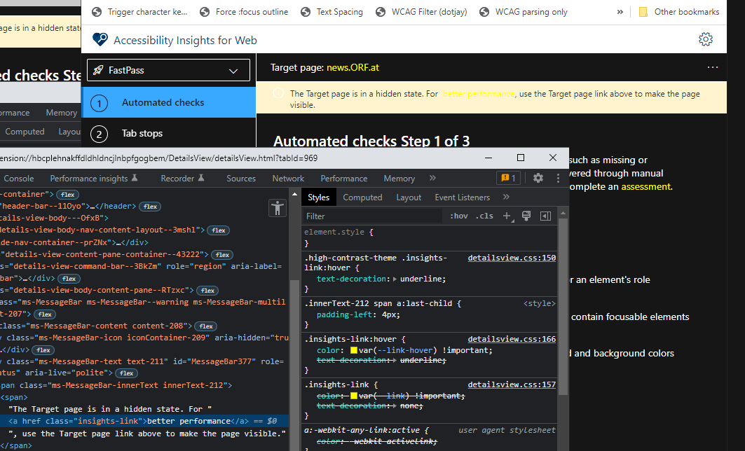
When Accessibility Insights is switched to the high contrast theme, there are contrast issues in the message bar: the icon appears white on light yellow, and any links inside the message are saturated yellow on light yellow.
This screenshot was provided by https://twitter.com/TkDodo/status/1547580473743794183?s=20&t=dWI73ySGWxujaTZ5oGxPkg

I was personally not able to trigger this specific message (as I think I’ve got sufficient privileges set for the iframe issue not to occur), but just brutally sticking a link (using devtools) into the message bar gets me to the same visual result:
To Reproduce Steps to reproduce the behavior:
- Open the “Fast Pass” window
- Set AI to high contrast (Settings > Enable high contrast)
- Switch to another tab in the browser - the message bar appears “The target page is in a hidden state…”
- Note the white info icon
- Trigger a message bar that also contains a link (it seems with insufficient permissions, a page with an
<iframe>will do it), or just use devtools to add a link into the above “The target page…” message box, making sure to set the link to<a href="..." class="insights-link"> ... </a>
Expected behavior
The icon and the links should have sufficient contrast (3:1 minimum for the icon, 4.5:1 minimum for the link)
Context (please complete the following information)
- OS Name & Version: Windows 10.0.19044 Build 19044
- AI-Web Version & Environment: Accessibility Insights for Web - Canary 2022.7.13.1526
- Browser Version: Google Chrome 103.0.5060.114 (Official Build) (64-bit) (cohort: Stable)
- Target Page: any
Are you willing to submit a PR?
I could give it a try
Did you search for similar existing issues?
Yes
Additional context
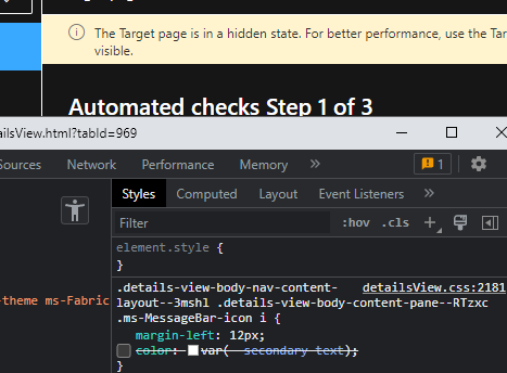
For the icon, it seems the problem is caused by the use of color: $secondary-text in details-view-body.scss
:global(.ms-MessageBar-icon) i {
    margin-left: 12px;
    color: $secondary-text;
}
In high contrast, this is set to white, resulting in the white icon on light yellow. The simplest fix may be to just remove the color definition, which will lead to the icon just inheriting the regular text color.
For the yellow links, it seems the problem is that there’s no specific color adaptation for the insights-link for when it’s in the message box. For all other places, there’s usually a black background, so the yellow colour works fine there. You’d need an extra case for links inside the message bar…setting it just to black for instance (with underline).
Issue Analytics
- State:

- Created a year ago
- Comments:8 (8 by maintainers)
 Top Related StackOverflow Question
 Troubleshoot Live Code
 Top Related Reddit Thread
 Top Related Hackernoon Post
 Top Related Tweet
 Top Related Dev.to Post
 Top Related Hashnode Post
good stuff, cheers @JGibson2019
Thanks for the contribution @patrickhlauke!