
Lightrun Answers was designed to reduce the constant googling that comes with debugging 3rd party libraries. It collects links to all the places you might be looking at while hunting down a tough bug.
And, if you’re still stuck at the end, we’re happy to hop on a call to see how we can help out.
Add FilterToolbar component as a flexible abstraction around Toolbar (previously DataToolbar) to reduce boilerplate for common filtering use cases
See original GitHub issue(tl;dr: I wanted to create a central place to discuss use cases and considerations for a reusable filtering-specific abstraction around the Toolbar component)
While building multiple tables with filtering controls for https://github.com/konveyor/mig-ui based on our current filterable table demo, I found that there is a lot of boilerplate required to get this to work, and that demo is tightly coupled to the specific filter columns/categories in its example. E.g. adding new filters would require new methods equivalent to the onNameInput and onLocationSelect and new state with some repetition, and the code for building the dropdowns would need to be altered. It is also written as a complex class component, and I didn’t want to convert the function components I was working with.
I think this demo still has value as a demonstration of how one might use the building blocks of the Toolbar to make something custom, but I also found myself duplicating a lot of code for the same simple filtering use case in various tables, which became a bit of a mess to maintain. I started experimenting with an abstraction in mig-ui (draft here, needs improvement) which has made it much easier to add different filters to all the other tables in the project.
I started discussing this with @nicolethoen after I saw her discussing different filtering use cases on Slack, and we agreed that it would be nice to make something like this available in PatternFly, as long as we consider most common use cases and make it flexible enough to avoid locking people in an abstraction that won’t work for them.
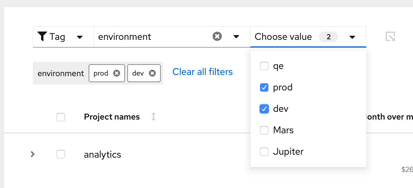
Basic use case
I have a dropdown of categories (columns), and when a category is selected a filter control is revealed next to it based on the type of category:
- Search filter: a TextInput where the user can type a string for a partial value match
- Select filter: a Select component with predetermined options for values to match
- ???: we could enhance this in the future with built-in support for other types of filters
- Custom: we’d export reusable context and props so someone could build e.g. a datepicker filter control, or whatever else they need, and pass it as children.
Possible API?
The consumer-facing API for the abstraction could look something like this:
<FilterToolbar filterValues={filterValues} setFilterValues={setFilterValues}>
  <FilterToolbarSelectControl
    key="location"
    title="Location"
    options={[
      { value: 'raleigh', option: <SelectOption value="Raleigh" /> },
      { value: 'boston', option: <SelectOption value="Boston" /> },
      { value: 'westford', option: <SelectOption value="Westford" /> }
    ]}
    placeholderText="Any"
  />
  <FilterToolbarSelectControl
    key="status"
    title="Status"
    variant={SelectVariant.checkbox}
    options={[
      { value: 'running', option: <SelectOption value="Running" /> },
      { value: 'stopped', option: <SelectOption value="Stopped" /> },
      { value: 'degraded', option: <SelectOption value="Degraded" /> }
    ]}
    placeholderText="Filter by status..."
  />
  <FilterToolbarSearchControl
    key="name"
    title="Name"
    placeholderText="Filter by name..."
  />
</FilterToolbar>
And in this example, filterValues would be an object that maps category keys to value arrays, e.g.:
{
  location: ['westford'],
  status: ['stopped', 'degraded'],
  name: ['my-cluster']
}
The consumer would be able to store and manage this state and the logic of filtering their data by these values themselves, but we could also provide an optional reusable solution for that (like I did in mig-ui with a useFilterState React hook here). Either way, category selection and chip groups would be handled automatically, and when the user applied a filter, removed a chip or cleared all filters, the setFilterValues callback would be called accordingly.
This example is tailored to the basic use case though, and we should consider making it capable of handling more complex use cases:
Other use cases
Nicole mentioned that @dlabrecq was trying to build a filter toolbar with sub-categories (one dropdown reveals another dropdown which reveals the filter control):
Also, she mentioned that @jcaianirh was asking about having multiple filter categories in one grouped checkbox select, like this example. Right now the Toolbar structure assumes a 1-to-1 relationship between the ToolbarFilter (filter control wrapper) and a chip group, so we’d need to change it so there can be a 1-to-many relationship there.
These use cases brought up questions about how the existing Toolbar deals with multiple nested ToolbarFilter children, and Nicole and I started brainstorming solutions for that. The general consensus there was that we may need to modify the existing Toolbar to make it more flexible, but we shouldn’t complicate it with more functionality to build this abstraction into it, the abstraction should still be its own component and consumers can choose the level of abstraction that meets their needs. The existing component(s) should remain (and maybe be simplified) as building blocks reusable at a lower level.
Thoughts?
Thanks for reading my lengthy write-up. How do y’all feel about these ideas? Are there any other use cases you want considered here? I hope to find some time to iterate on my mig-ui prototype of FilterToolbar and make a PR for you to play around with soon.
Issue Analytics
- State:

- Created 3 years ago
- Comments:24 (9 by maintainers)
 Top Results From Across the Web
 Top Related Medium Post
 Top Related StackOverflow Question
 Troubleshoot Live Code
 Top Related Reddit Thread
 Top Related Hackernoon Post
 Top Related Tweet
 Top Related Dev.to Post
 Top Related Hashnode Post
Still planning to work on this as soon as time allows. Go away stalebot.
You make a convincing argument. I’m open to adding them as beta components post-v4 if the documentation surrounding them it is good.