
Lightrun Answers was designed to reduce the constant googling that comes with debugging 3rd party libraries. It collects links to all the places you might be looking at while hunting down a tough bug.
And, if you’re still stuck at the end, we’re happy to hop on a call to see how we can help out.
Investigation on SVG accessibility
See original GitHub issueDescribe the issue. What is the expected and unexpected behavior?
On the insights dashboard where there are a lot of charts, the charts have a <title> which comes up when hovering over the SVG for an extended period of time. The insights team found this to be a usability issue in that the title tooltip that appears can block data in some cases.
In our charts, the aria-title prop is a pass through to the Victory library. The actual Victory property is just title, but we call it aria-title to be clear. The charts are SVGs, so Victory outputs this as a title tag within the svg itself. When you have a title tag, it is native browser behavior to have a tooltip that appears when the mouse is held over a spot on the SVG for an extended period of time. This tooltip appears wherever the mouse is held on the SVG. Taking off the title tag could have potentially negative accessibility side effects.
When researching, I found this article that explains all the different combinations that can be done with SVGs and how they work across different screen readers which provides excellent guidance with the accessibility: https://www.deque.com/blog/creating-accessible-svgs/
Based on the research, it appears that the most recommended combination is <svg> + role="img" + <title> + <desc> + aria-labelledby="[ID]" as it was the most reliable choice for the different browser and screen readers that were tested. As the above article explains, taking off the title is not preferred for most use cases as it can cause the SVG to be significantly less accessible. You can remove the title element and add an aria-label like in Pattern 3 in this research, however it will cause the SVG to be read as an image so the user will be unable to interact as easily with the chart by screen reader.
We should investigate if there are improvements that could be made to our charts/SVG accessibility and see if there are better solutions to the title tooltip concerns.
Please provide the steps to reproduce. Feel free to link CodeSandbox or another tool.
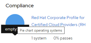
If you go to our pie chart example and hover over any section of the chart, you can see the title tooltip appear. This appears to be the concern that Insights is having: https://www.patternfly.org/v4/documentation/react/charts/chartpie/basic-with-right-aligned-legend
Is this a bug or enhancement? If this issue is a bug, is this issue blocking you or is there a work-around? Enhancement to our charts accessibility. Work around - if you see this as a significant usability issue for visual users, you can take off the title as long as it’s replaced with something else like a proper aria-desc to ensure the user is getting the information. You could use an aria-label, but you have to be aware of the fact that it will make the svg be read as an image and be less accessible. You would need to relay the information inside the chart in a different way to screen reader users. The above article explains all of the different combinations that you could try and the different results you will have given the pattern you choose.
Issue Analytics
- State:

- Created 3 years ago
- Comments:10 (10 by maintainers)
 Top Related StackOverflow Question
 Troubleshoot Live Code
 Top Related Reddit Thread
 Top Related Hackernoon Post
 Top Related Tweet
 Top Related Dev.to Post
 Top Related Hashnode Post
@christiemolloy - can you put a link to the victory issue in this issue here once it’s created, pls?
Related POC: https://github.com/patternfly/patternfly-react/pull/5138