
Lightrun Answers was designed to reduce the constant googling that comes with debugging 3rd party libraries. It collects links to all the places you might be looking at while hunting down a tough bug.
And, if you’re still stuck at the end, we’re happy to hop on a call to see how we can help out.
Line style for line charts
See original GitHub issueI’m submitting a … (check one with “x”)
- bug report - search github for a similar issue or PR before submitting
- feature request
- support request - use StackOverflow (add the
ngx-chartstag) or the gitter chat for support questions
Current behavior Line charts (as far as i could see) has only one default appearance for every line (continuous)
Expected behavior Would be nice to be able to set line appearance to something like “dashed” or similar, bonus points for setting just a portion of the data as “dashed”
What is the motivation / use case for changing the behavior? Have a better visual of the resulting chart, for example to recognize real values against estimated values. Something like this: http://www.andypope.info/ngs/ng45.gif
Issue Analytics
- State:

- Created 5 years ago
- Reactions:27
- Comments:11
 Top Related StackOverflow Question
 Troubleshoot Live Code
 Top Related Reddit Thread
 Top Related Hackernoon Post
 Top Related Tweet
 Top Related Dev.to Post
 Top Related Hashnode Post
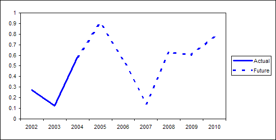
I used a combination of the two tips given to me above,
stroke-dasharrayproperty withnth-childby comfortme. It worked well.I used a similar css approach for getting other shapes besides circles in the bubble chart, but it still feels very hacky (partially because we can’t target these components with the component css, since it’s outside the angular css scope). Seems like a very common requirement to be able to add a css class to lines or points in a series, seems like this could really be a powerful change that could enable a lot more chart flexibility-
https://github.com/swimlane/ngx-charts/issues/998#issuecomment-503569946
@lukekroon I had to put it in the global scss file, since otherwise it can’t target these components outside of the angular component scope-